- The seven deadly sins of religion (cartoon) (via Atheist Blogger)
- An Atheist Goes Undercover to Join the Flock of Mad Pastor John Hagee – including demons. Long, but worth reading (via JLT)
- German: Die GEZ hält sich mal wieder für schlauer als die, die ihre Geräte abmelden…
- German: Germany’s top 50 blogs design comparison – an extensive statistical analysis.
- German: Results of the blog carnival “What to put in the sidebar.”
- And a video with a jazz pantomime (via Stefan Graf):
Links of the Week (2008/29)
I already presented two videos separately – here are the “normal” links:
- Motivational posters for atheists (engl.)
- Death Match: Pineapple vs Coconut – which is the theist’s worst nightmare?

- 33 beatuiful blogs in German language (you still can look at the designs on the screenshots regardless of your language, of course).
Everywhere and nowhere
united-domains.de had their special offer of 1€ per year for .eu domains in June (this month it’s .info) – and I registered, just for fun, llareb.eu, which is ue.berall spelled backwards, and überall is German for everywhere/anywhere.
I don’t really know yet what to do with it – maybe I’ll just cancel it after this cheap year –, so for now I’ve put up a little JavaScript silliness which I might expand from time to time. So have a look, can be a little time filler (for maybe 5 seconds or so); maybe some of you can even create “artworks” with it… ![]()
Ideas and suggestions for improvements welcome…
House advertising
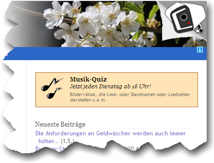
Inspired by the “samples” in the top of the screen at the German blog directory BloggerAmt (and other fades-in/out e.g. for polls), I thought I could add some small announcements and notices of special posts, smoothly faded in and out, on my blog, like this one for my music quiz:

If it doesn’t look for you as on the screenshot, please click “reload” or press F5 in your browser…
At first, I tried it above the main content, but that felt too obtrusive, too distracting – so it’s now at the top of the sidebar.
What do you think of it? Annoying? Too inconspicuous? Just right? Any other opinion? ![]()
Technical note: The items are managed like a blogroll in a separate category, the display is done with a little function integrated into the theme – if you’re interested, » here’s a text file with the code, but, for the time being, only with German instructions (anyone need it in English?).
Update: For a shorter jQuery solution, see this comment.
Drawing a _blank
 This is a post for a German blog carnival about whether to have external links open in a new tab/window – by giving them the attribute
 target="_blank" – or not.
Actually, I’m quite surprised how many like this attribute – I, on the other hand, don’t like to be patronized that way at all. If I want to open a link in a new window or tab, I can do that as desired with Shift+left-click and middle click (or Ctrl+left-click), respectively, or via the right-click context menu – these options seem to be way too little known. We should start a Middle Click Awareness Week…
On notebooks (with touchpad) you then need either the right click, spread your fingers or use the other hand.
If the website/blog owner, on the other hand, is using the target="_blank" attribute, I don’t have an easy way to open the link in the same window/tab, which I actually do want to do sometimes (yes, not with each and avery click you desperately want to stay on the original page, for at some point, you actually have seen enough for this visit ![]() ) – so I got an unneeded tab open that I have to close manually.
) – so I got an unneeded tab open that I have to close manually.
On notebooks (with touchpad) you then have to cumbersomely move to the close button of the tab or window (or use a key combination).
 By the way, especially for smaller mobile surfing devices (which have lower resources) this may become more of a convenience and performance problem; this certainly applied to the “Nokia 770 Internet Tablet” I had been using for some time.
So the only argument in favor of _blank seems to me the lack of knowledge of some web surfers regarding the ways to operate their browsers. And some particular arguments of _blank supporters – some of which seem to want it for all links – I can’t follow at all (no offence meant): Lia, for instance, writes in this comment (in German; my translation:):
I’m always annoyed when I have to click an image to enlarge it and then have to click the Back button!
 To what extent is it easier and more comfortable to close a window or tab than to click the Back button? By the way, many mice with more than 3 buttons have the Back funtion by default on the 4th button!
And Prinzzess seems to prefer to type a former URL again and fret about that over using the Back button, which offers a longer history on all reasonably useful browsers without mass click orgies. Or over taking control by herself with middle click & co. in the first place…
Regarding the standards conformity which is against this attribute, well, this isn’t that important to me, the visitor comes first (and this target attribute doesn’t cause display problems, anyway).
So my “campaign slogan”:
![]() Against patronizing, against
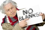
Against patronizing, against target="_blank"! ![]()
Photo © absolut – Fotolia.com