- The past and the (not always serious) future of famous company logos (via @heuni)
- If anyone still wants to see carnival photos from around the world, there are some at The Big Picture
-
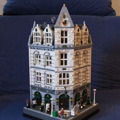
I finished another Lego house – see MOCpages or Flickr
-
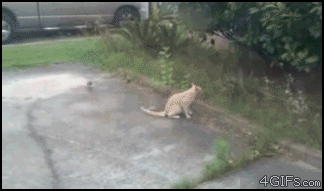
This can happen if you (as a bird) make a cat angry: (via Animals Being Dicks)
-
Robin Ince about science and how understanding does not remove the wonder and the joy (via Astrodicticum Simplex)
(Something was embedded as Flash object here. Not exactly sensible anymore.)
Interruption with edges and corners
I already posted my rant here about the strange combination of rounded and cut-off corners in the ZDF’s football design, and even though the design is much less bad than the message, that is the missing image thanks to the blackout in Vienna where apparently the signal for all stations worldwide is routed through (by contract) from the UEFA (except Switzerland, since Basel, where the match took place, is in Switzerland, so that the ZDF was able to take SF’s signal later on), I do have to complain about the edges and corners of this screen (which is similar to the natíonal league’s results tables, if I remember correctly) in this long sentence, which I’m also wondering whether you guys even read it completely – slanted in one place, rounded in another, slanted and rounded in yet anotrher – who’s designing stuff like that?

Translation: Interruption – The lines from Basel are interrupted. Please have a little patience.
Anyway, I’ll go and continue to celebrate… 

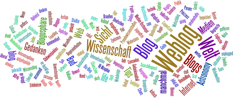
Let’s have a Wordle
Word clouds on steroids, if you will, can be created with Wordle, with some options for font, layout and color. For instance, this may look like the following image (click to enlarge) for my “On the trail of afterlife” article:

Or like this for what I wrote about this full moon astrology rubbish yesterday:

Nice toy…
Or my complete blogroll (including brief descriptions):
That could be turned into a kind of blog baton – for everyone with a sufficiently large blogroll, ideally with descriptions: How does your blogroll look like in Wordle? I don’t pass it on specifically, though, if you want to participate, just do it…
(via Evil under the Sun)
Edges and corners
I know, the design that the ZDF is using for time and score display during football broadcasts isn’t new – if I remember correctly, they introduced it for the World Cup 2006 –, but I got to get that off my chest now:
I don’t mind rounding sharp corners to get a more pleasing look, but I think especially this shape with the overtime is rather dilettantish and unaesthetic:
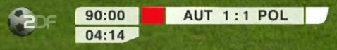
In the top left corner, the right angle is rounded with a small radius, on the right hand side there’s a large curve with a slanted edge, and the overtime has simply one corner cut off. I really think they could have made that in a more consistent way; I somehow don’t understand who could have come up with this combination and actually get it on air… or what do you think?
PS: Congratulations to Austria for tying the score, but you’re gonna lose on Monday! ![]()