Tag Archives:

television

Horribly… odd and funny

Dr. Horrible (vertical) Joss Whedon – yes, that Joss Whedon of Buffy and Firefly fame – just released the first of three acts of his low-budget interim project (during the writers’ strike in Hollywood), a supervillain musical called „Dr. Horrible’s Sing-Along Blog“ online.

That musical is, of course, meant anything but serious and is poking fun at quite a lot – and that’s not the only reason why you can’t actually compare it to “Once More With Feeling”, the Buffy musical episode – and worth a look at any rate! (Even though you may wonder at the beginning whether it will go on like that the entire time.)

So watch it quickly, for Dr. Horrible is scheduled to disappear again on Sunday night already (and be available for money later on), after act II and III are released on July 17 and 19, respectively.

(via Golem)

Interruption with edges and corners

I already posted my rant here about the strange combination of rounded and cut-off corners in the ZDF’s football design, and even though the design is much less bad than the message, that is the missing image thanks to the blackout in Vienna where apparently the signal for all stations worldwide is routed through (by contract) from the UEFA (except Switzerland, since Basel, where the match took place, is in Switzerland, so that the ZDF was able to take SF’s signal later on), I do have to complain about the edges and corners of this screen (which is similar to the natíonal league’s results tables, if I remember correctly) in this long sentence, which I’m also wondering whether you guys even read it completely – slanted in one place, rounded in another, slanted and rounded in yet anotrher – who’s designing stuff like that?

interruption

Translation: Interruption – The lines from Basel are interrupted. Please have a little patience.

Anyway, I’ll go and continue to celebrate… :jubel: :applaus:

Edges and corners

I know, the design that the ZDF is using for time and score display during football broadcasts isn’t new – if I remember correctly, they introduced it for the World Cup 2006 –, but I got to get that off my chest now:

I don’t mind rounding sharp corners to get a more pleasing look, but I think especially this shape with the overtime is rather dilettantish and unaesthetic:

ZDF display

In the top left corner, the right angle is rounded with a small radius, on the right hand side there’s a large curve with a slanted edge, and the overtime has simply one corner cut off. I really think they could have made that in a more consistent way; I somehow don’t understand who could have come up with this combination and actually get it on air… or what do you think?

Do you like this design?

View Results

Loading ... Loading ...

PS: Congratulations to Austria for tying the score, but you’re gonna lose on Monday! :mrgreen:

1001 + 2×147 + 18:8 + 17 + 3 – ½ = …

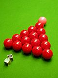
Snooker-reds 1316.75. And good entertainment. ;)

  • 1001 frames in World Snooker Championships finals since 1977 in the Crucible Theatre in Sheffield.
  • Two maximum breaks (147 points) last week – scored by the two finalists, Ronnie O’Sullivan and Ali Carter.
  • With 18:8 frames, Ronnie won today’s final…
  • …after 17 championship days…
  • …for his 3rd world championship title. Congratulations!
  • Unfortunately with a power outage of over half an hour in Eurosport’s broadcast center this afternoon, so two frames were missed.

Links of the Week (2008/18)

All are German this week, sorry…

  1. Update 5.9.11: Link geändert, der urspr. ist derzeit/mittlerweile nicht öffentlich zugänglich []